There is something just so magical about before and after photos, on any subject really - food, houses, weight loss, organization. If you're anything like me though, you know that nothing is ever really done. And I don't mean that I don't finish things, I do!, just that... my house is always evolving to be more like who I am, who we are as a family, and what our current needs are. I swap artwork and pillows and decor around all the time. Which is why I'm calling this post "Kitchen: Before + Progress". So, here is the one before photo I snapped - unfortunately after the wall between the two rooms already came down! But what a difference already, right!?!? (I promise to get better at taking before photos for all future house projects!)
From the very day we moved into our house (October 2009), we always knew we wanted the wall to come down between the dining room and our tiny kitchen. But until we could make that happen, our dining room was painted white to brighten up the space, and our kitchen was painted to look more like the 1950s, with the powder blue cabinets and sunny pop of yellow above. When we first moved in the kitchen was shades of tan with forrest green trim straight out of the 1990s. It was bad. I have photos of this somewhere, but can't seem to find them currently.
Anyway, fast forward to fall of 2015 and we asked Josh Strayer, of Home Improvement Services, to do a few projects on our house for us - the biggest one of which was our kitchen remodel.
Here's a rough breakdown of what did:
- Removed the wall between the dining room and living room.
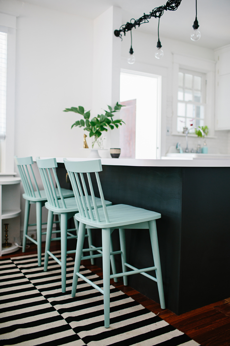
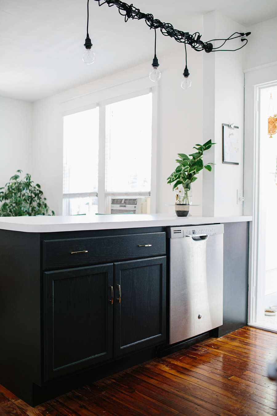
- Custom "island" counter with storage below and bar top seating on the other side.
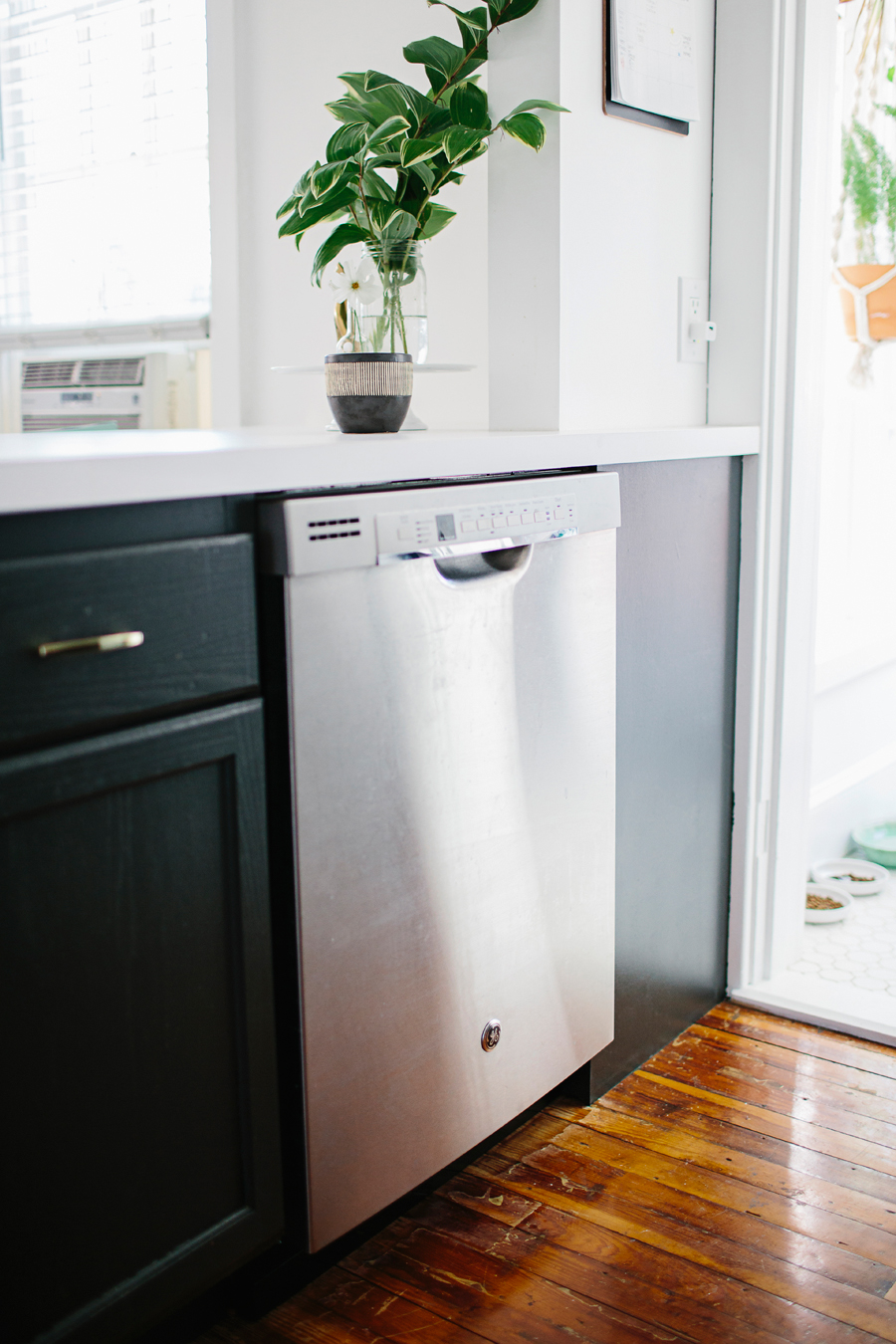
- A dishwasher installed under new countertop!!!!!!!! (Suck it, sink!)
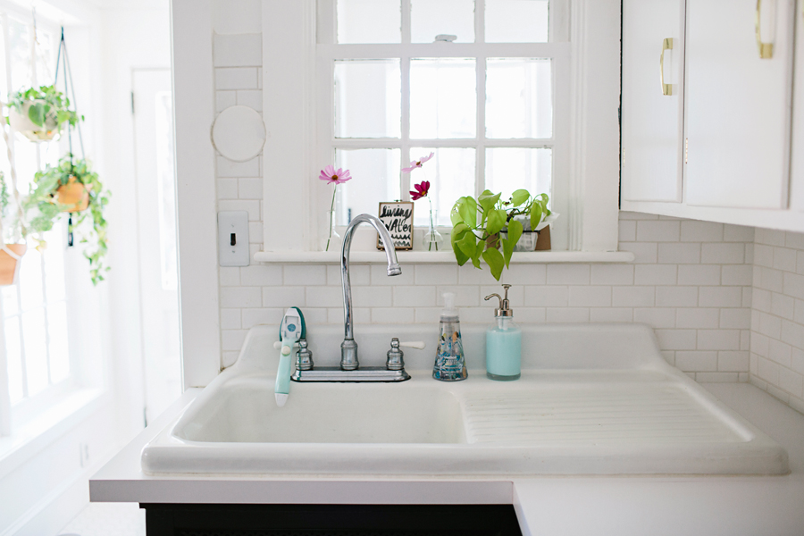
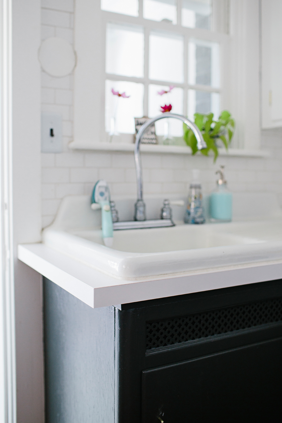
- Replaced the small existing counter tops around sink area to match new counters.
- New oven (it just so happened to crap-out the week we were buying the dishwasher!)
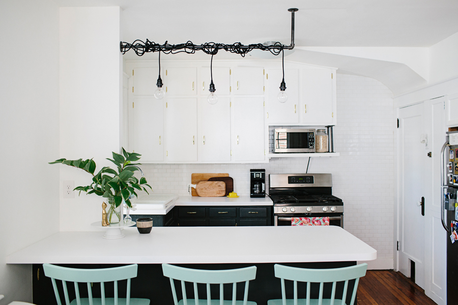
- White subway tile backsplash was installed floor to ceiling on the wall with the oven.
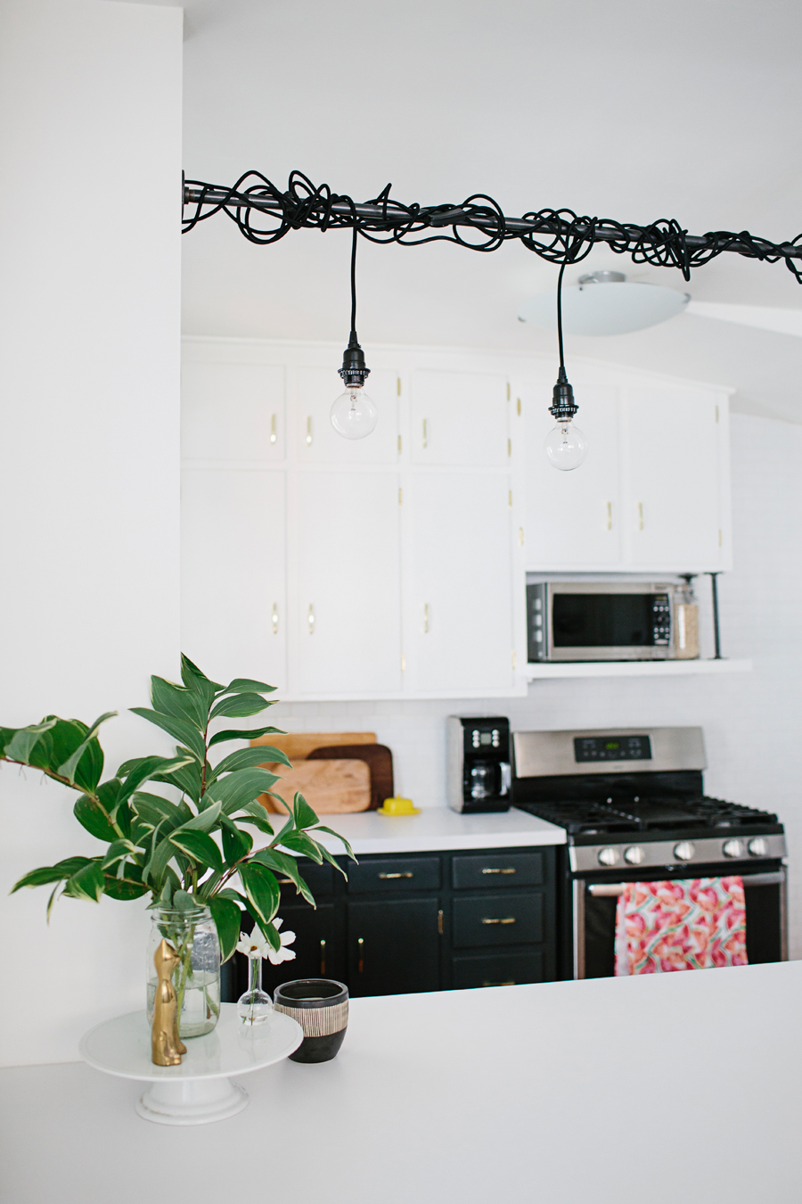
- Painted lower cabinets Space Black by Benjamin Moore.
- Painted upper cabinets and walls Bright White - straight off the shelves at Home Depot (Behr).
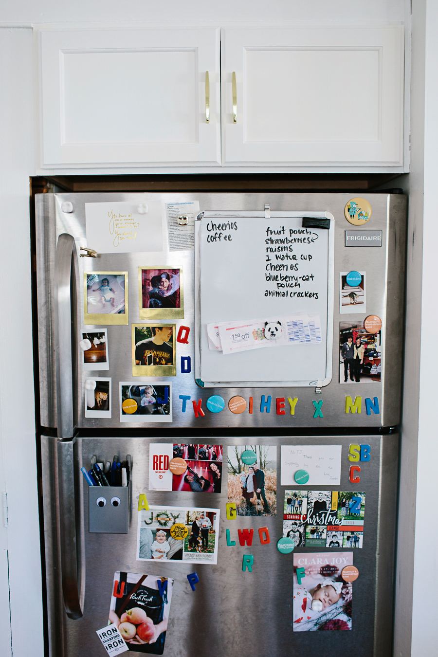
- Added a small cupboard for storage in the "dead space" above the refrigerator.
- Added additional outlets and a dimmer.
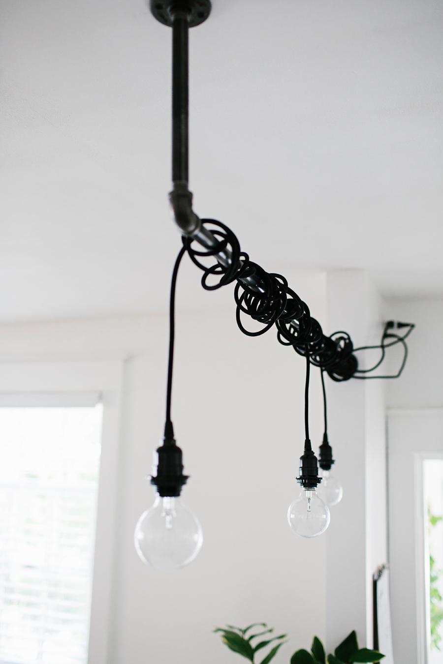
- Had an outlet installed high in the wall, knowing we wanted to plug in our cord lights that we wrapped around the pipe/fixture we made.
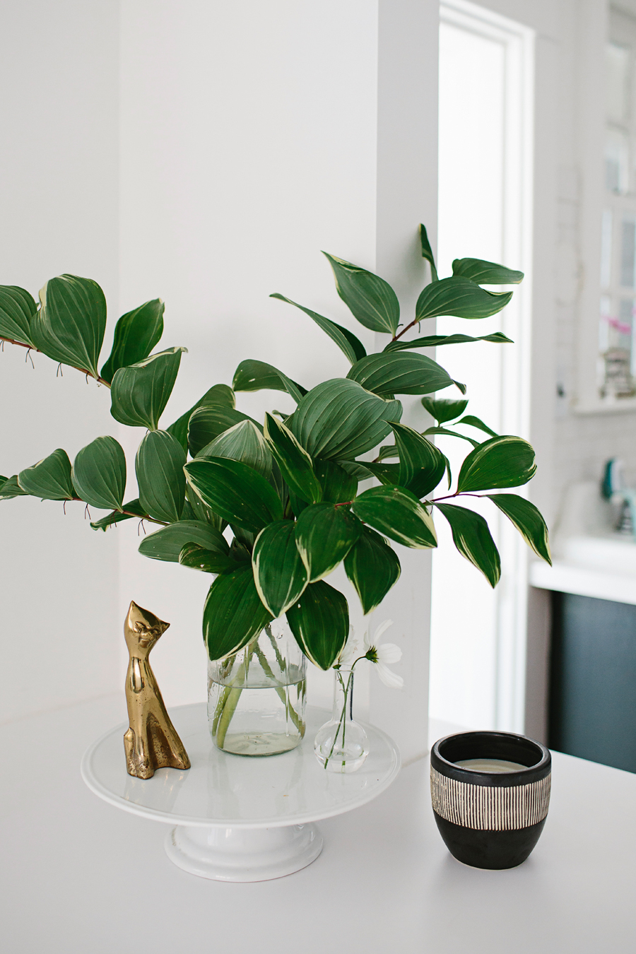
- Changed out all hardware to be brass. (Planning to change out sink faucet soon, too!)
- Replaced the boob-light in the kitchen to match the existing dining room light (from Ikea.)
Happy to report that with all those changes, this is what our kitchen looks like on an average day.
We honestly can't say enough times how much we love it. It literally changed our entire house. Removing the wall brought so much light, and life, to the kitchen. I can now cook and prep food and not feel like I'm all alone, shut in behind the wall. We've already had more people over for dinner in 2016 than we ever did.... like, ever before. Haha!
Adding the dishwasher was equally life changing. Dishwashers are amazing. They like.. wash your dishes while you sleep. And then you get up and BAM! they're clean. #magic
Adding the new white countertops was one of my favorite choices we made. It's so bright and allows for lots of Instagramming and food photography to happen easily. So worth it. I also love that adding the new countertops raised our existing sink. It now feels like more of a feature of our kitchen, where before it got a little lost over there in the corner. Our house has a lot of that 1929 charm, which is why we bought it in the first place, so keeping the original sink and cabinetry was always part of the plan.
I'm really looking forward to continuing to host dinners, add a little artwork here and there and eventually decorate the new kitchen for Christmas. I'll be sure to share more "progress" photos when I do.
Feel free to comment, or contact me, with any questions you might have about our little kitchen update! And for one last whoa ... here they are side by side.


